


In a dramatic fashion, ‘Moonlight’ was crowned Best Picture at the 2017 Oscars, where ‘La La Land’ was originally announced the winner.
What happened
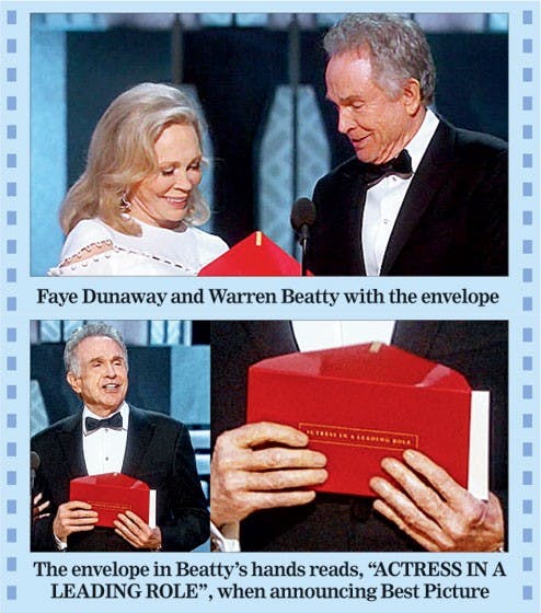
Warren Beatty: And the Academy Award (hesitates) for best picture… (hesitates again)
Faye Dunaway: You’re impossible. C’mon.
Beatty hands her the envelope.
Dunaway: La La Land.
The crowd erupts in applause, and the La La Land cast approaches the stage.
What are they saying
Warren Beatty said he had been given the wrong envelope to open. “I opened the envelope and it said Emma Stone, La La Land,”
In Beatty’s hand was a spare best actress envelope. Emma Stone had already been given her winning envelope, but two sets are printed, one for each of the two PwC representatives who wait in the wings to distribute the envelopes to presenters.
“At the end of the day, we made a human error,” said PWC
What really happened
Hosts can read card, problem is bad UX design
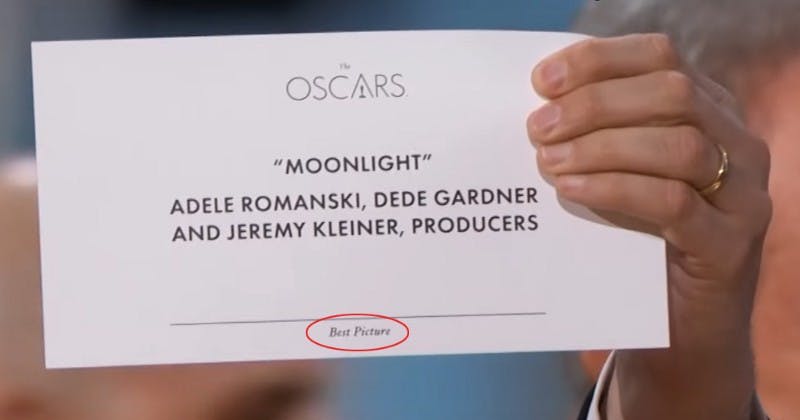
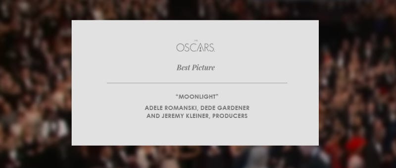
Oscars Card design
The most important element of the card i.e. Award name is at the bottom and in small font and also in a position where it can be easily blocked by the fingers of the person holding the card.
When Warren Beatty read from the card he saw it’s written “Emma Stone, La La Land”. Maybe his fingers were over the “Best actress” text at the bottom and he didn’t see it, neither Faye Dunaway. If it was written on the header with big font, this mistake never would happen.
If Beatty and Faye can see that they are given a wrong card the whole situation could be avoided.
How the UX of the Oscars card can be improved
It’s okay. Sometimes designers stay under pressure and make some mistakes. It can happen to anyone. When we were discussing this matter in our office of RedElegant, Showvhick, our lead designer re-built the envelope which can avoid future mistakes of bad UX . Here’s the look —
Here is the video of the moments for you, in case you missed it - https://www.youtube.com/watch?v=8KeOxeuiZjs