Give us a visit
PS Qube Action area II-D, New Town Kolkata, Pin -700136
Couldn't reach? Drop a mail
hello@appradius.co![]() Close
Close

Loadshare branding and website design
Loadshare Networks empowers the regional logistics SMEs (small and medium enterprises) withTechnologyand Operations know-how. This enables us to serve shippers through a pan-India network of capable partners with regional expertise.
Our Contributions
logo design
Visual identity design
Website UX/UI
The Process
We followed Lean UX Design thinking process . We first created a unique branding guideline for them. Then we moved to other parts of the task. So we first made their logo which should carry positive meaning, vibe and goes with their offerings and name. We had words with their existing product partners, incubates to understand their product well. We had words with the client to understand their business goals and priorities.
Logo Making
We had to create a logo based on their name. Firstly we went behind meaning and motive of the name. So they are actually sharing logistic loads with multiple partners.
Based on this we made a structure of the logo which will basically a curvy rectangle. We mostly get inspired by real life example while creating a branding material. We discovered what load means and tried to portray same thing in our work.
![]()
We were happy with the “Load” word visualization. Then we moved to “Share” concept. We kept it as simple as possible. Used the universal share icon concept to build this and integrate into the Load icon.
![]()
Now to finalize the design we identified the best suitable color for the branding. Blue signifies faith, trust and integrity and it goes with any kind of color as background, bright or dark. So we choosed a very sophisticated variation of blue which will neither be too bright or too dark. And for typography we used Avenir for branding purpose.
We were pretty happy with the logo design as it portrays what we wanted to portray through the logo and it's trendy, classic, printable anywhere. Will look good on website, bags.
![]()
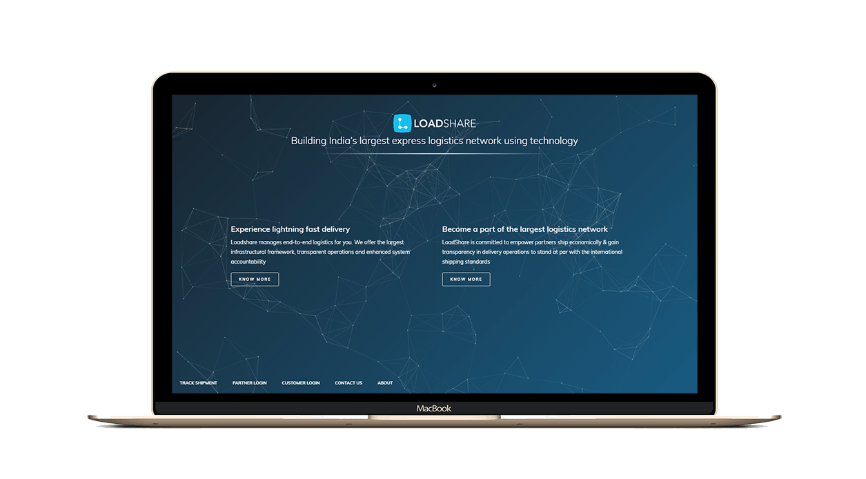
Home Page
Our objective was to keep the website very much focused. We wanted to direct the traffic to the proper sections in order to deliver most suitable content, reduce bounce rate and increase page views. As the website was intended for two type of audience and the TG is very niche, we kept two separate sections addressing two distinct type of audience. Target was to help people navigate properly to the respective sections.
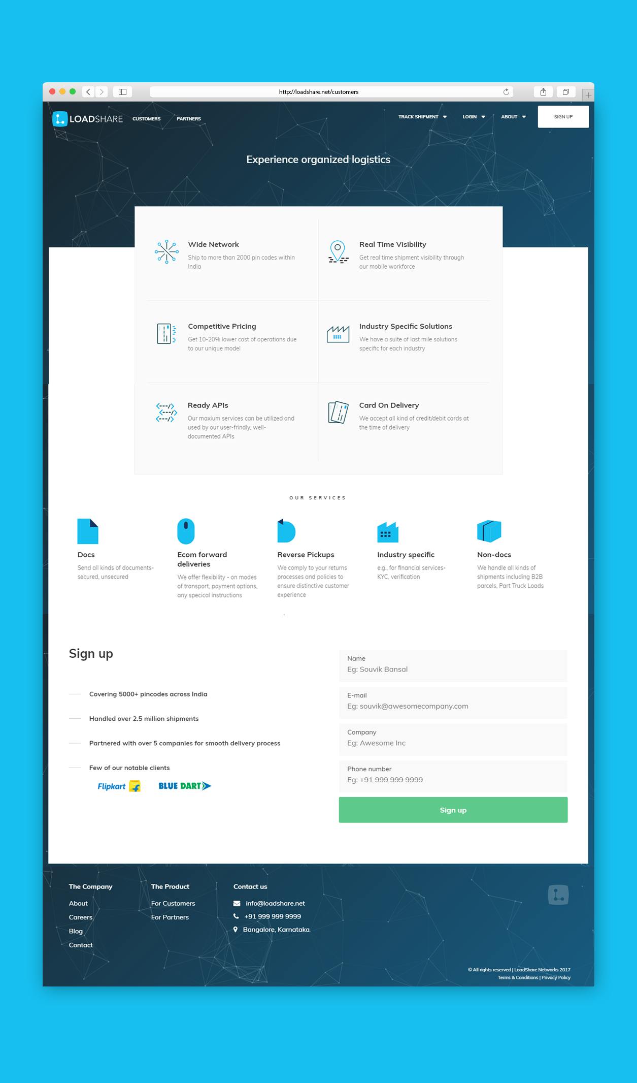
Details page
The detailed page designs are intended for very a particular audience type who are coming to the respective pages Either from Homepage or from Advertisements. So in this details pages we showed them how Loadshare can help them achieve more in their respective business. Best feature sets and best services were portrayed to capture audience attention.
Conclusion
This project challenged us to think differently. Designing a vibrant color scheme, logo and focused UX of the website was fun and challenging. Creation of a different appeal and providing structured information and in turn helping our client prior to raise funds gave us immense pleasure.
Other Case Studies
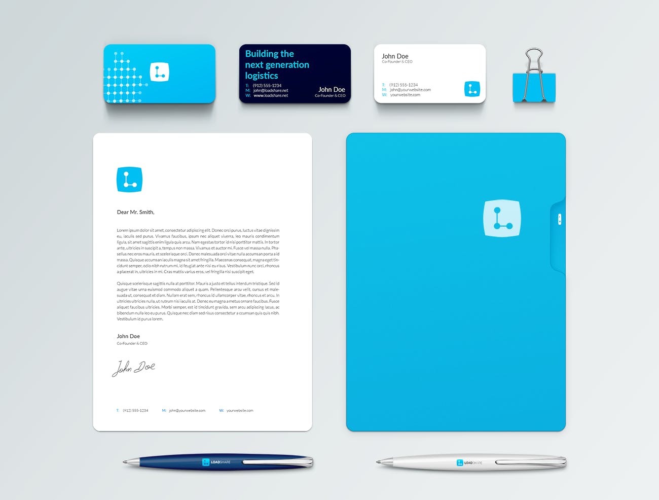
HCD Chauffeurdrive Identity design
We designed their logo and respective merchandise design like brochure, business card and letterhead which will give them an edge over their competitors.
View Project